De Beauvoir House
Playful Patterns, Islington
211.4 sqm / 2,275 sqft
Our clients were a young family with a 2 year old and a baby on the way, wanting to refurbish their home in time for their new arrival. The project involved some reconfiguration of the rooms - we turned the second floor into a kid's’ floor with a bedroom, nursery and bathroom, and moved the main bedroom down to the first floor, turning what was a pokey office into a walk-in dressing room.
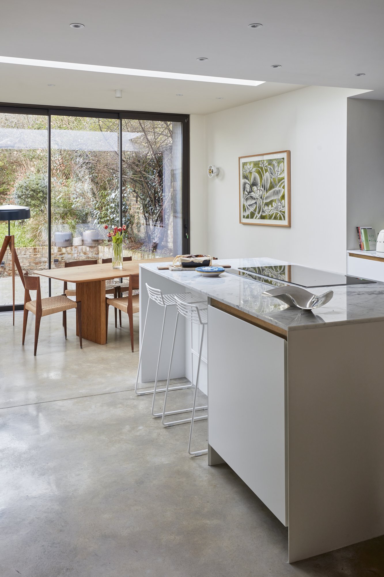
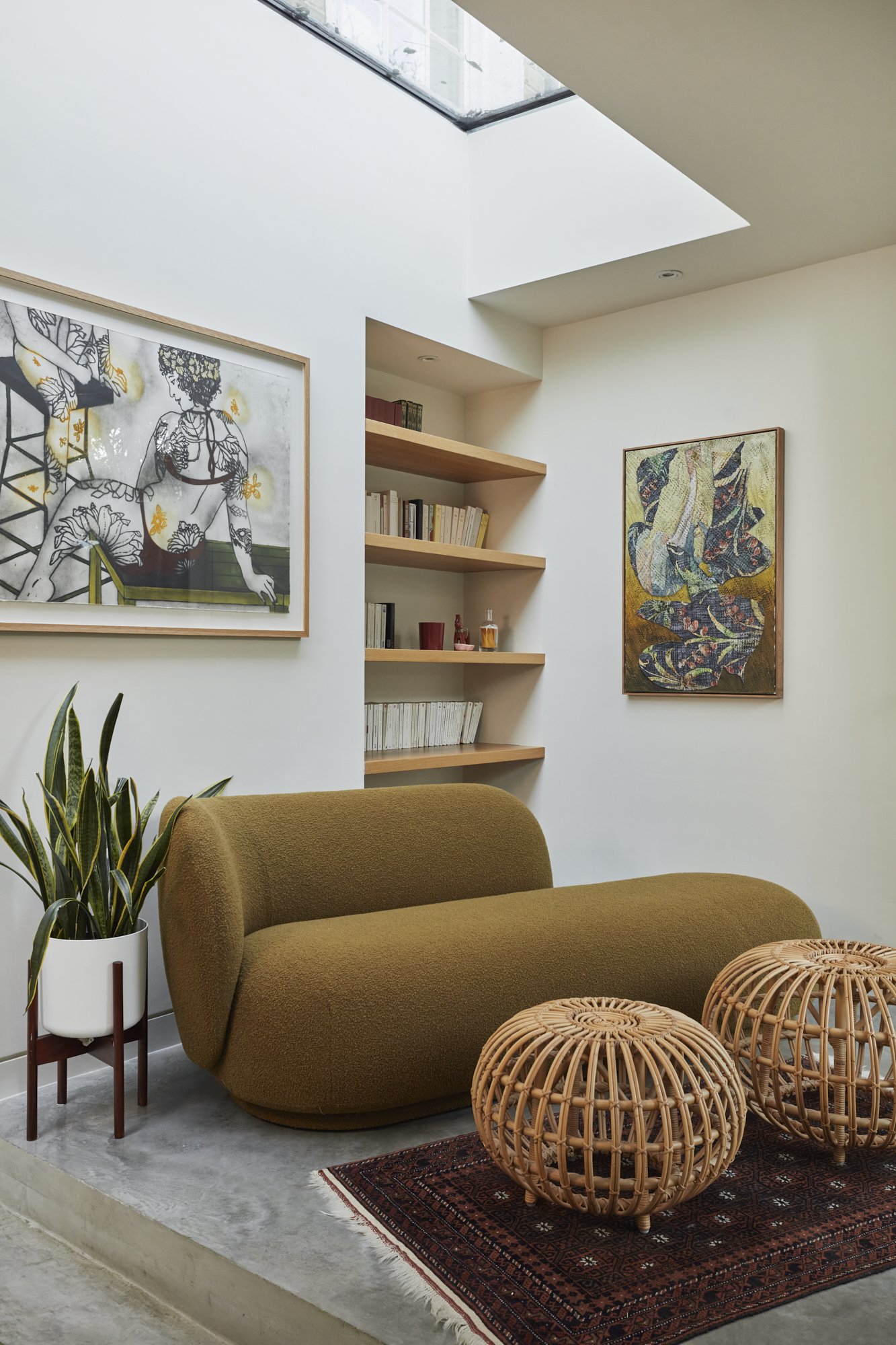
The kitchen was replaced five years ago so the work in this area for us was minimal - the whole house was repainted, and we furnished the dining space and reading nook, drawing colour inspiration from the client’s beautiful art collection.
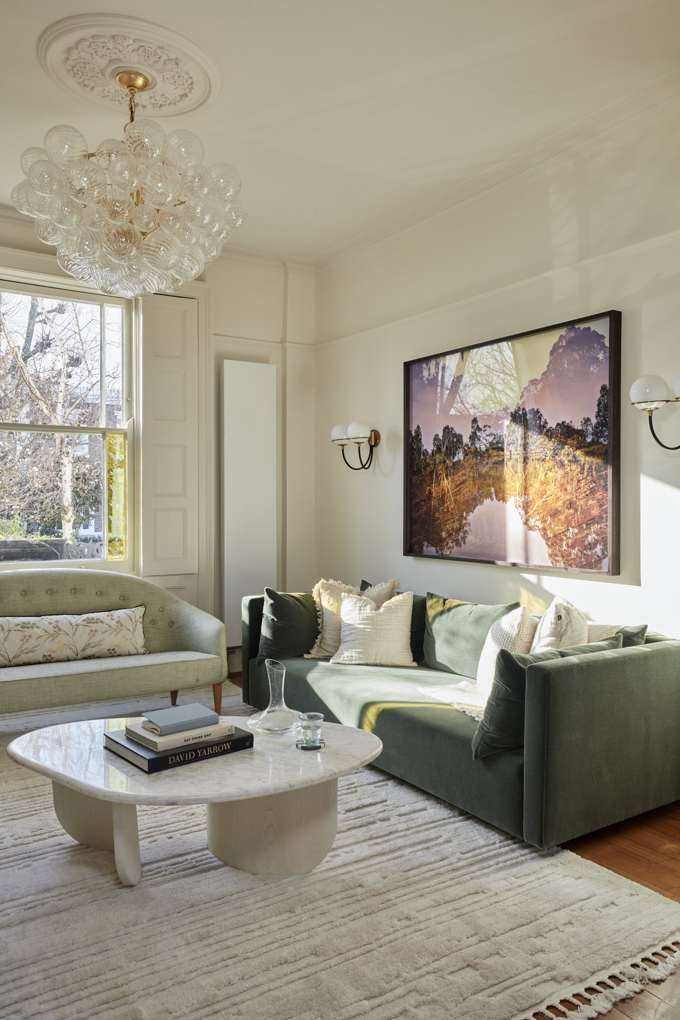
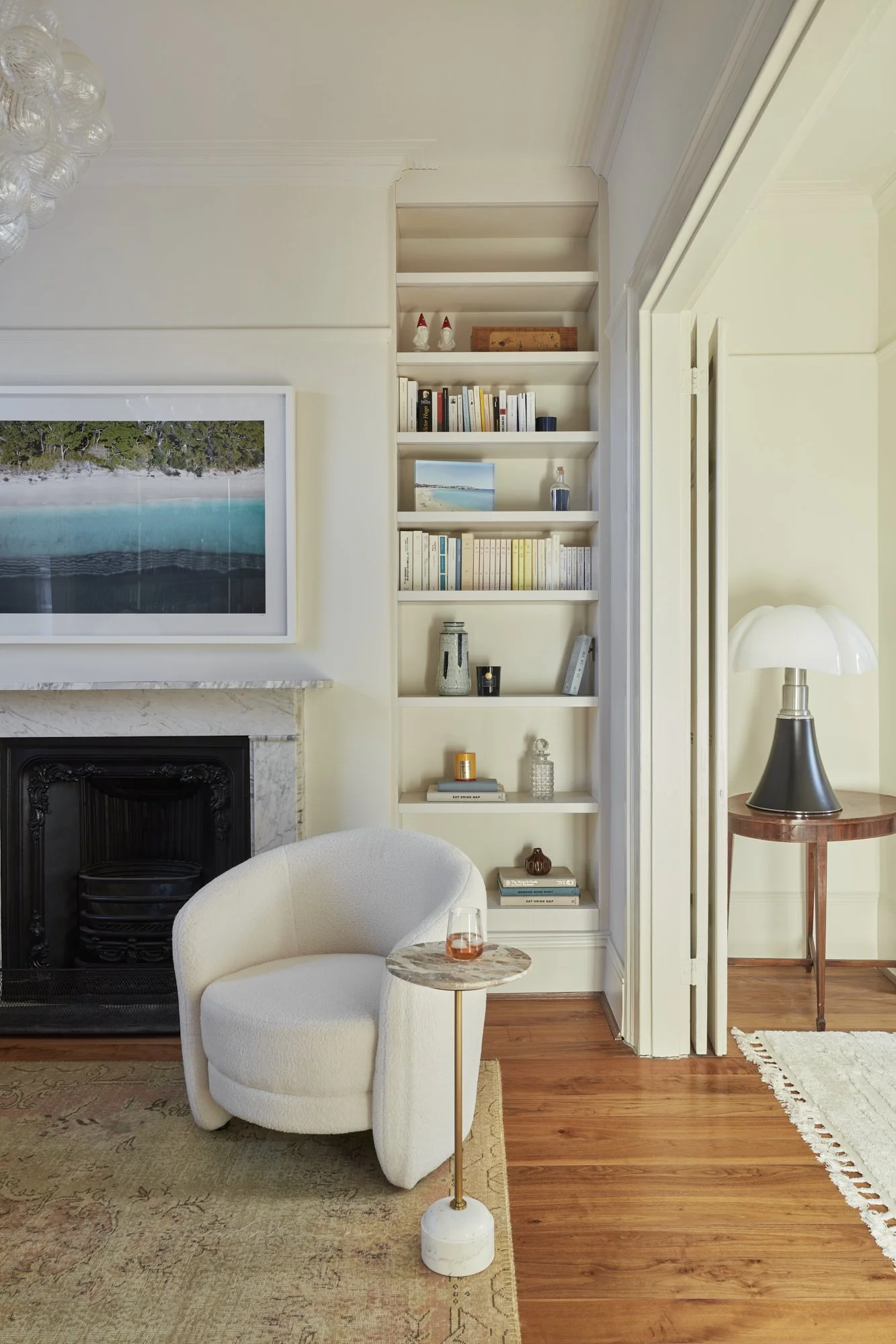
The formal reception on the first floor was divided with double doors into two spaces - the living space and the study / adult space. Our starting point and inspiration was the client’s existing Swedish-style sofa, which they had reupholstered in a mint green fabric not too long ago.
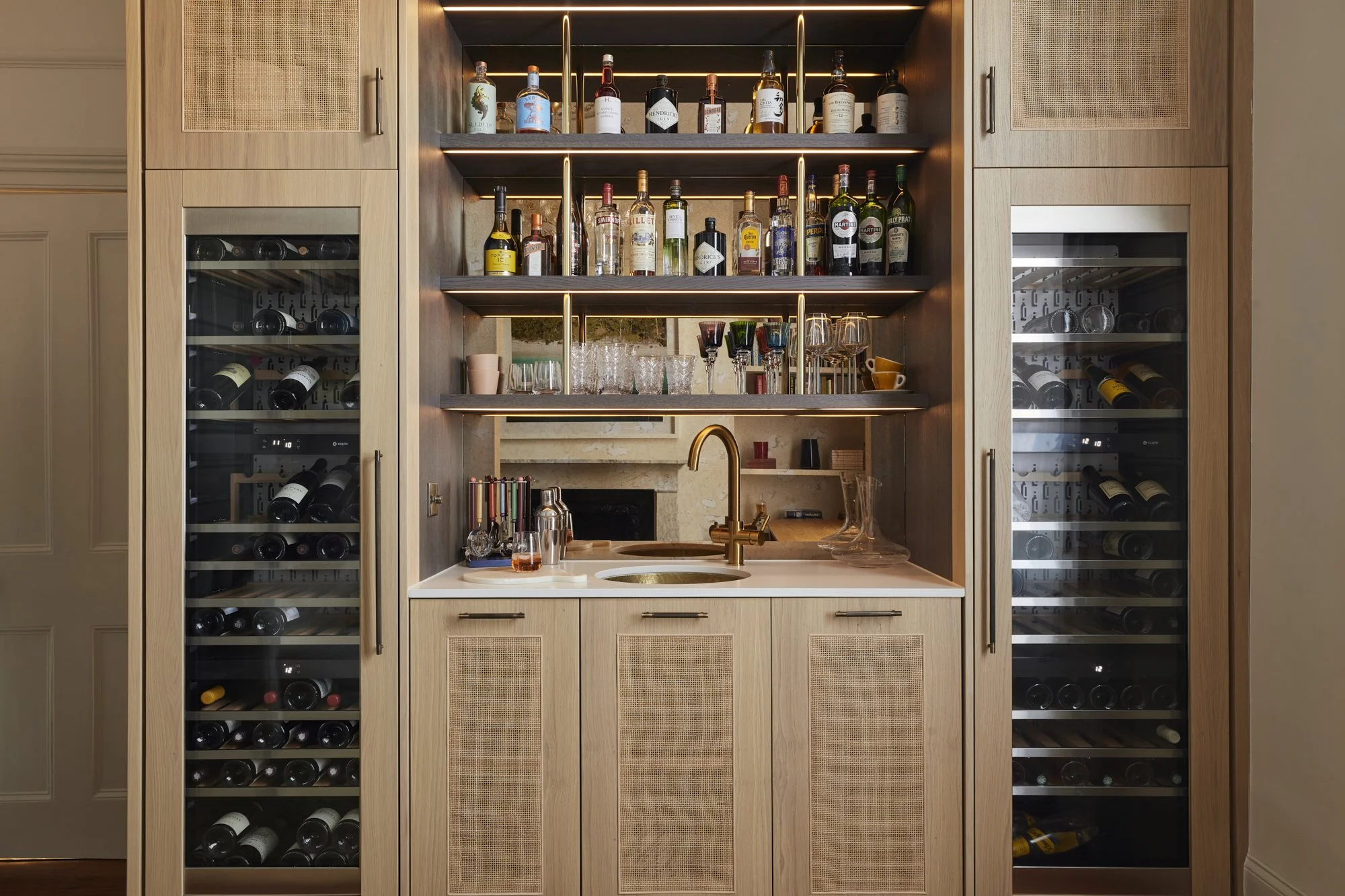
We positioned the desk in front of the window to benefit from the garden view, created some new built in book storage and designed some bespoke joinery with rattan door fronts for their new feature bar.
Statement Joinery
We created a bespoke bar for our client’s study / adult space using two colours of wood stain and rattan door fronts, bronze mirror splashback, metal rod detailing on the shelving and integrated LED lighting. The mini basin is handmade from hammered brass.
Inside the cupboards there is space for storage as well as a custom drawer that holds an ice maker.
Statement Suite
We suggested to move our clients’ main bedroom from the second floor to the first floor - this allowed us to create a main bedroom suite with a walk-in dressing room and en-suite. The main bedroom itself was quite compact, but has big impact with the Gucci Heron wallpaper.
The starting point for this design was the client’s existing pendant light, which was a wedding gift that they wanted to keep - we wove in some matching accessories to tie the colours together.
In the main en-suite, we used a combination of large format marble effect porcelain tiles and subway style ceramic tiles to pair in with the main bedroom design and to make the most of the generous ceiling height in this space.
We love how the heron wallpaper interacts with the bathroom colours through the mirror reflection.
In the walk-in dressing room, we designed full-height fitted wardrobes with rattan door fronts to match the bar, with a custom cutout handle design, angled shoe shelves and a central island on castors to make the most of every inch of available storage space.
We converted the second floor to a kid’s floor with kid’s bedroom, nursery and shared bathroom. In the bedroom, we disguised some IKEA Billy Bookcases as built in bookshelves, applied some rainbow wallpaper and brought it all together with a rusty red wall colour and lots of natural wooden and rattan accents.
In the nursery, we used the William Morris willow bough wallpaper with a sweet sandy wall colour for a warm but gender neutral nursery scheme for the new arrival. We reused the existing built in wardrobe carcasses but created new doors with matching rattan fronts for continuity.
Playful Bathroom
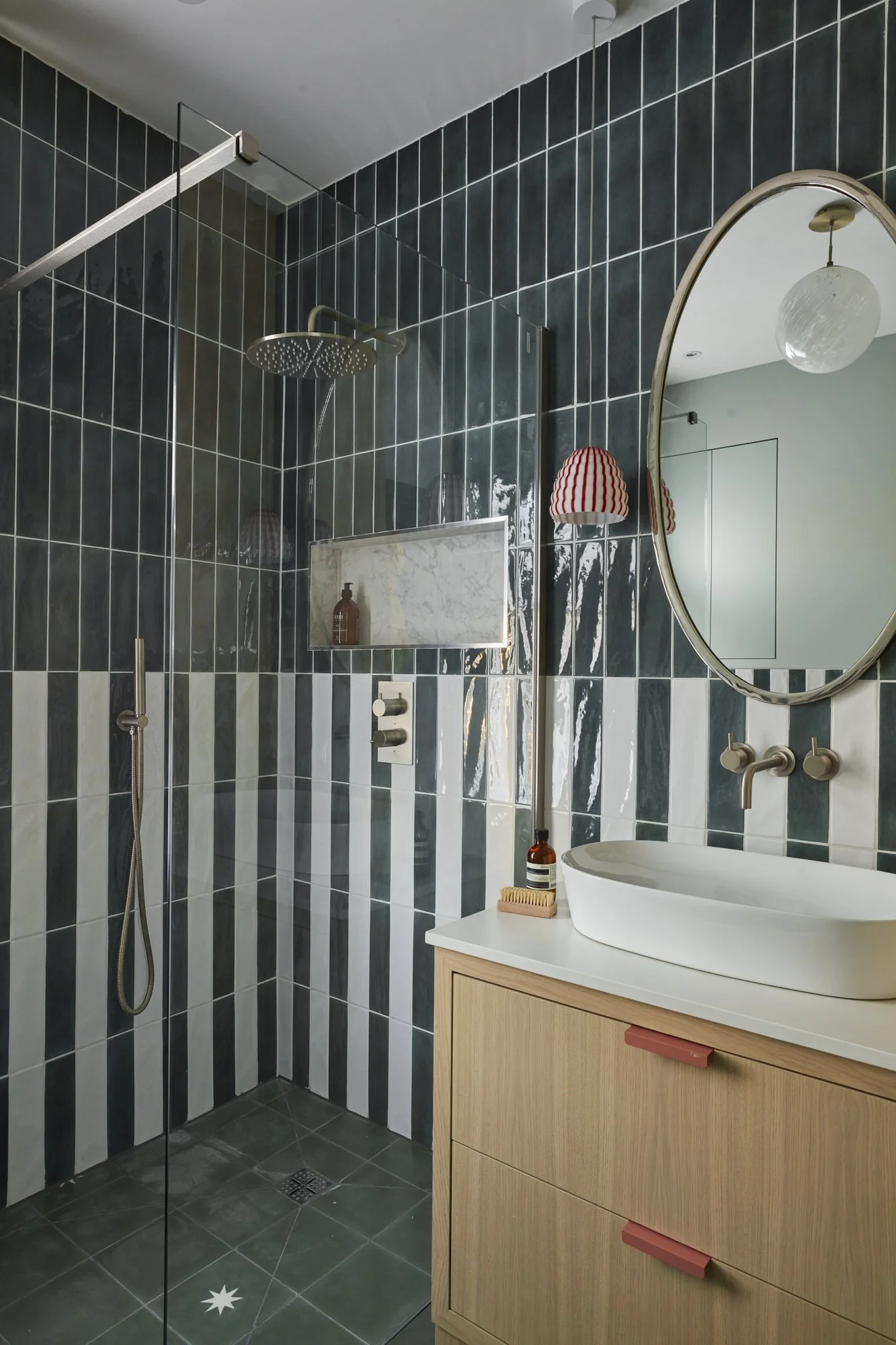
For our kid’s bathroom, we wanted to create a scheme that felt cohesive with the main bathroom but with an added playful touch - we used a combination of vertically laid subway style tiles in two colours, star print floor tiles and large format marble tiles. The tall storage cupboard and vanity unit were custom made by our joiners.
Photographer: Chris Snook

