Brompton House
Calm & Collected, Earl’s Court
65 sqm / 699.6 sqft
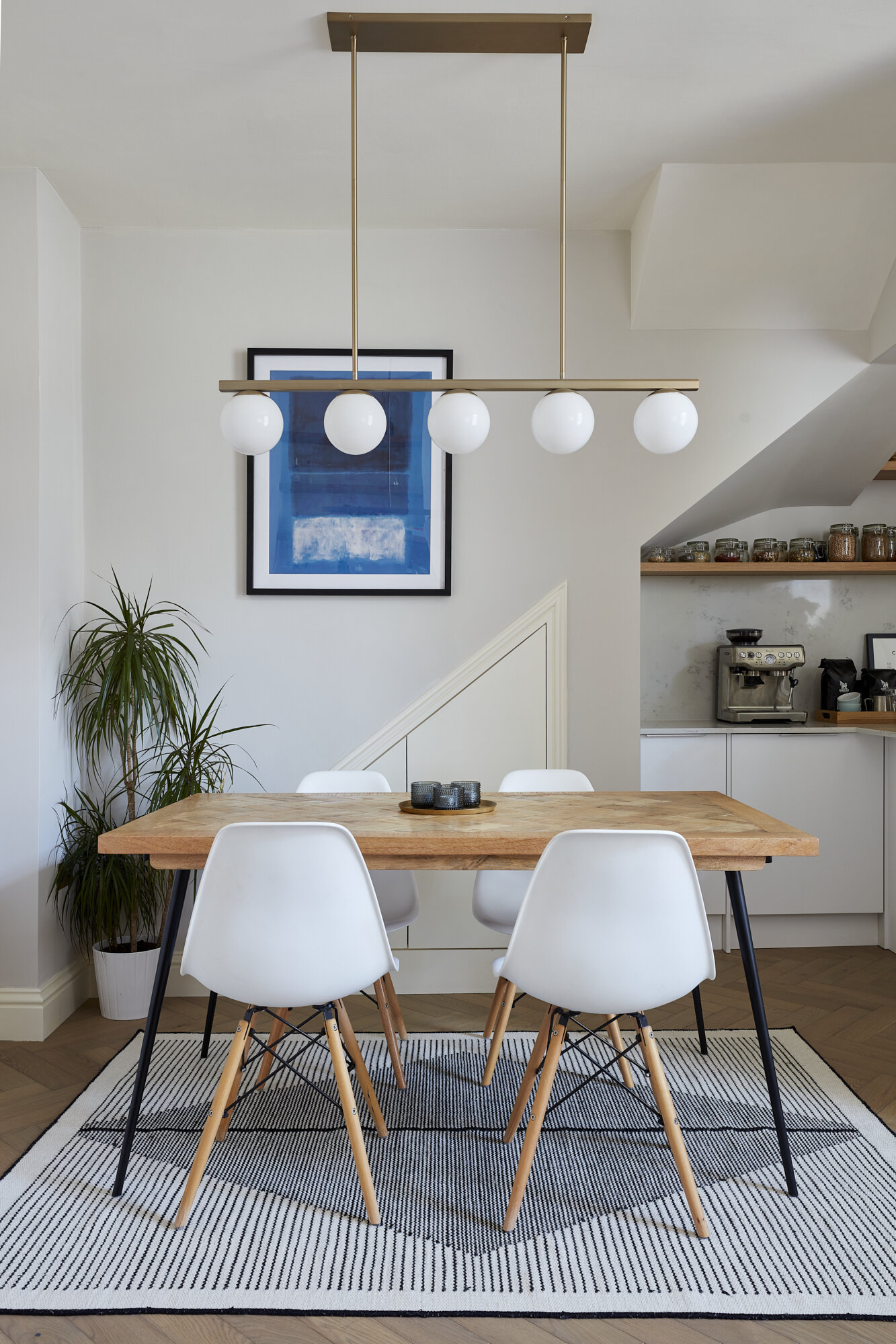
The brief for this pied-a-terre in Earl’s Court was to create a light and clean Scandinavian inspired design that maximised the layout and storage.
Our priority with the layout was to maximise flow and storage space - we opened up the kitchen and living area to create an open plan kitchen-living-dining space and added built in wardrobes/cupboards in the hallway, dining room, bedroom and study to keep clutter to a minimum.
The kitchen is from a high-street supplier but we lifted the look by using a combination of matt white and natural oak handleless door fronts, a beautiful carrara marble effect composite worktop and customised it by adding some bespoke wooden shelves and a bespoke liquid metal box to conceal the extractor hood.
Calm and Collected
We worked with earthy and light tones to create a calm, elegant and cosy scheme. The wall-to-wall headboard was made bespoke with the purpose of visually extending the size of the room - the walnut shelf added on top by our joiners also serves as useful bedside space in addition to the bedside tables as well as a place to display artwork and ornaments.
Muted Monochrome
In the bathroom, we opted for a cool monochrome scheme with a crittal style shower screen and fluted tiles. The patterned floor tiles add a subtle wink towards a heritage style in keeping with the period of the property and contrast with the otherwise contemporary scheme. A recessed and backlit storage cabinet and spacious vanity unit add storage capacity and an LED-lit niche creates a place to set down a toothbrush and other toiletries.
Less is More
A skinny console table, mirror and hanging lights in the hallway bounce light to create the impression of added space. Light paint colours, including our go-to favourite F&B Ammonite were used throughout the property to create a soft and cohesive colour scheme.
As always we aimed to re-use as much of the client’s existing furniture as possible, only buying new where necessary.
Photographer: Chris Snook


